Beneath Your Feet, Inside Your Mind: The Psychology of Rug Color and What It Does to a Room
There is a reason a room anchored by a deep crimson rug feels fundamentally different from one grounded in sage green—even when every other element remains identical. Color is not merely aesthetic shorthand; it is a physiological and psychological force. Light wavelengths enter the eye, trigger neurological responses, and influence everything from heart rate to perceived room temperature to how long a person chooses to linger in a space. For interior designers and homeowners alike, understanding this mechanism transforms rug selection from a stylistic preference into a strategic act.
The rug occupies more visual real estate than almost any single object in a room. It establishes the tonal foundation upon which furniture, lighting, and art are layered. Choosing its color with intention—rather than impulse—is one of the most powerful tools available to anyone shaping a living environment.
The Warm-Cool Divide: Energy Versus Ease
Color temperature is the most fundamental variable in rug selection. Warm hues—reds, oranges, terracottas, golden yellows, and the rusted ochres that have dominated American interiors in recent years—activate the nervous system in measurable ways. Studies in environmental psychology consistently associate warm tones with increased alertness, heightened social energy, and a perceived rise in room temperature. A saffron-toned Moroccan flatweave in a dining room does not merely look inviting; it physiologically encourages conversation and appetite.
Cool hues operate by an opposing mechanism. Blues, blue-greens, soft grays, and lavenders have been shown to lower perceived stress levels, slow the pulse slightly, and create a sense of mental spaciousness. A bedroom anchored by a dusty blue wool rug signals the nervous system toward rest before a single pillow has been fluffed. In open-plan American homes—where living, dining, and kitchen zones often share continuous flooring—a cool-toned rug can demarcate a lounge area as a deliberate retreat from the activity happening just beyond its border.
Neither register is inherently superior. The question is always: what does this room need to do for the people inside it?
Saturation and the Perception of Space
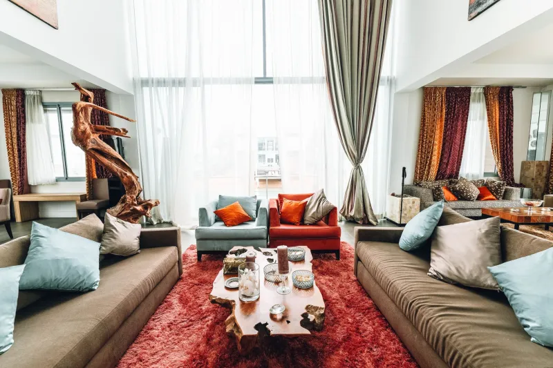
Beyond temperature, saturation—the intensity or purity of a color—shapes how a room reads dimensionally. Highly saturated rugs, those with vivid, undiluted hues, advance visually. They draw the eye downward and make a space feel smaller, more intimate, and more energetically charged. This quality is an asset in a large, underscaled living room that feels cavernous and cold; a richly saturated jewel-toned rug pulls the walls inward and creates a sense of intentional enclosure.
Desaturated, muted, or tonal rugs—think dusty rose, warm greige, faded indigo, or the soft naturals found in undyed wool—recede visually. They expand perceived space and lend a room an unhurried quality that feels current in the American design moment, where the maximalism of the early 2010s has given way to quieter, more considered interiors. Designers working with smaller urban apartments or low-ceilinged suburban rooms frequently reach for low-saturation rugs precisely because they refuse to compete for attention.
A practical rule of thumb: when a room is already rich in pattern, texture, or color from furniture and art, a desaturated rug provides visual rest. When a room is spare and monochromatic, a saturated rug provides the focal tension that keeps the space from reading as empty.
Room by Room: Matching Color Psychology to Function
Living Rooms benefit from colors that balance social energy with comfort. Warm neutrals—camel, warm ivory, terracotta—encourage relaxed gathering without the overstimulation of a fully saturated warm tone. Designers working with families often favor these hues because they read as welcoming without demanding emotional attention.
Bedrooms call for the nervous system's lowest gear. Soft blues, muted greens, and cool lavenders are the most research-supported choices for promoting sleep quality and reducing ambient anxiety. Interestingly, certain warm tones—blush, soft peach, warm sand—also perform well in bedrooms because they evoke skin tones and tactile warmth without activating the alertness associated with true reds or bright oranges.
Home Offices present a nuanced challenge. Productivity research suggests that moderate blue-greens and soft greens support sustained concentration, while warm yellows in low saturation can encourage creative thinking without tipping into distraction. Designers outfitting home offices for clients in analytical fields frequently favor cooler, muted palettes; those working with clients in creative industries often introduce a warmer accent through a rug's secondary tones.
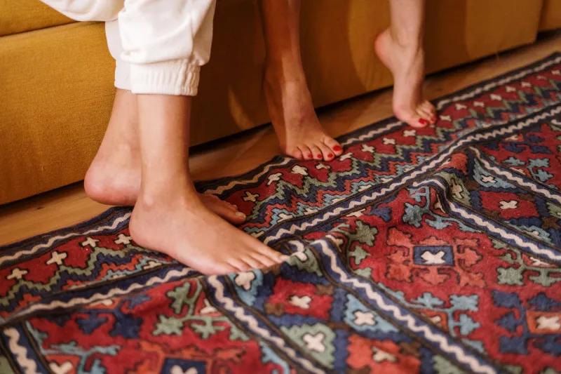
Kitchens and Dining Areas respond well to appetite-stimulating warm tones. The hospitality industry has understood this for decades—there is a reason fast-casual restaurant chains favor red and orange branding. In residential settings, a terracotta runner or a warm-toned kilim beneath a dining table subtly encourages the enjoyment of meals and the extension of conversation.
Children's Rooms warrant particular care. Highly saturated primaries are often defaulted to in nursery and playroom design, but research suggests that softer, more naturalistic tones—sage, warm butter yellow, dusty sky blue—support calmer behavior and longer attention spans. Bold color can be introduced through smaller elements without making the rug itself a source of visual overstimulation.
Color Combinations: Contrast, Harmony, and Psychological Weight
Single-color analysis only goes so far. Most rugs present combinations, and the relationship between those colors carries its own psychological charge. High-contrast combinations—navy and ivory, black and white, deep red and cream—create visual tension that reads as dynamic and sophisticated. These rugs work well in rooms designed for impact, such as formal living rooms or entryways, where a first impression is the primary goal.
Analogous combinations, those that draw from adjacent points on the color wheel, produce harmony and visual cohesion. A rug moving from warm sage to muted olive to soft gold feels resolved and restful—appropriate for rooms where sustained occupation is the point. Complementary combinations, pairing colors from opposite sides of the color wheel, introduce energy and vibrancy. A rug with coral and teal, for instance, carries an inherent liveliness that makes it a strong candidate for a sunroom or casual family space.
Designers often use the rug's color combination to solve a specific room problem. A room that feels flat and lifeless may need a complementary-toned rug to introduce tension. A room that feels chaotic and overfurnished may need an analogous, low-contrast rug to impose visual order.
A Final Consideration: Light Changes Everything
No discussion of rug color psychology is complete without acknowledging the role of natural light. A rug photographed in a sun-drenched California showroom will read entirely differently in a north-facing New England living room receiving cool, indirect light for most of the day. Warm tones can appear muddy in low light; cool tones can feel clinical without sufficient warmth from windows or artificial sources.
Before committing to a rug, experienced designers request samples or borrow swatches and observe them across multiple times of day in the actual room. This discipline—unhurried, methodical, attentive—reflects the deeper truth that choosing a rug color is not a transaction. It is an act of understanding how a space lives, and deciding, with care, what it should feel like to be inside it.